
Building Blocks
10KFAM Style Guide
Here is a list of all the elements that have been built into your website.
Headers
Main Hero
Gutenberg Blocks
This is the exact same header section that gets auto-applied to each page. There are fields on the right side bar of the Page Editor under the tab Core Hero. Just fill those fields out along with the Featured Image and this block will be auto-appended to the top of the page.
Type in /Main and select Hero / Main Hero from the list. This block has a “Small Subtitle” that can be removed (paragraph). The large text will be auto-capitalized on the frontend (please don’t type in ALL CAPS). You can change the colors of the button, button text and button link. The “dots” get automatically added in on the frontend of the website.

Small Subtitle
About the 10K-FAM
Here is some amazing text about this and that; these and those. This will go right over here and will be a really cool place to put things about this or other items as well.
Middle Hero
Gutenberg Blocks
Type in /Middle and select Hero / Middle from the list. This block has an H1 tag for the title, center-aligned as well as some descriptive paragraph text. You can add as many buttons as you’d like in the row and alter their colors. Select the Container element to change the Background Image.
Regular Elements
Separator
Gutenberg Block
Type in /Separator to get the core “line divider” block. No settings here at all. Literally just drop it on the page and be done 🙂 If you add the CSS class is-small to the separator, it’ll make it one line + reduce the spacing above/below it.
Some random text goes here. This is just here to showcase some spacing. Nothing more. Nothing less. Just some simple placeholder text to show how much room each of these separators gives you when you apply the other CSS classes to them. Hopefully you didn’t just spend a lot of time reading this to be saddened it was just dummy text that doesn’t even matter.
CTA Strips
Gutenberg Block
Type in /CTA and select CTA Strip A, B or C (all options shown below). When you use this, please be aware of the “floating dots” on the right side so they don’t cover up buttons on the right side of the page (aka. in the section above, keep the buttons on the left).
[A] Have a question?
[B] Have a question?
[C] Have a question?
Get our newsletter
Do you want to get content like this in your inbox? Sign-up today!
Image Treatments (Also can be used on Headers)
CSS Class
The combinations with these dot patterns are almost limitless. Rather than creating a ton of reusable blocks you may never actually use, I feel this is the one technical piece that might just be worth writing out.
The core CSS class to know is tkfam-dots-STYLE-LOCATION-COLOR where all the all caps pieces will be replaced. Now let’s dive into how to construct this CSS class name.
Style
There are six styles to pull from and each are shown in a column below. Read the descriptions below each photo to know the name of each style and what “size box” of dots it gives you.
Location
This is either left or right. Do you want the box of dots to be displayed on the left or right side of the element? You can have two class names (one long one for left and one long one for right) to have two sets of dots attached to the same element (think a header that takes up a lot of space).
Color
When you’re editing some text in Gutenberg, you know the color palette on the side that shows you all the colors in the 10kFAM palette? Hover over the top row of colors (where your main colors are). Notice, there are “numerical names” in each. That is the name of the color (ex. the bright orange color is quaternary)


tkfam-dots-smallsquare-left-primary
smallsquare style has a static height and width (no matter what size element you attach it to, it will always be a tiny square).

tkfam-dots-largesquare-left-secondary
largesquare style has a static height and width (no matter what size element you attach it to, it will always be a larger square).

tkfam-dots-fulltop-left-tertiary
fulltop style makes the dot “box” the same size as what you attach it to and pushes it up either to the left or right depending on the class name.

tkfam-dots-middlelongrectangle-left-quaternary
middlelongrectangle style creates a “dot box” that is 30% the width of the item you attached it to + about 25% taller. This is great for headers to add an accent.
NOTE: middlelongrectangle is used on CTA Strip A, B, and C on the header.

tkfam-dots-tallrectangle-left-quinary
tallrectangle style has a static height and width and aligns to the bottom of it’s element. Recommended with taller images.

tkfam-dots-tallrectangletop-left-primary
tallrectangletop style has a will be 110% the height of it’s element (be careful where you use it) and be pushed up halfway up the element you attach it to (aka. it’s going to be tall).
Columns with Outlines
Gutenberg Block
This is a normal Columns block; feel free to add or remove columns by selecting the Columns block and changing the quantity of columns.
Type in /Columns and select Columns / Outlines. When you’re editing the individual column, if you change the background color of the column, it will actually set the outline and the shadow (and not the background). The first paragraph in the column should be a single word and will be automatically BOLD AND CAPITALIZED while the proceeding paragraph(s) will be normal.
Character
kjasd ka sdsdja sdaj lfj flajs dkahsd ajs dlasj dahsd jas djags dja sdkja kldjs lfjas ldaj sdkhas dajsldaj sdlj asd
Competency
kasd hjas dia fie qi laj dakjsd akhsd ajhsdjs dans dman efkwjf lj alsjd aljsd lasjf kejf wj qlw qlwj elqj elqjw elas dl
Community
ah dew oqi rlqw eqlwe lqje lqjw eqhw ejqw ehqbw enqw enbqw ekas dlajsd lqjw lqjs dlasj dakhsd abns dnab d
Circle Image Captions
Gutenberg Block
This is a normal Cover block with a CSS class of tkfam-circle-caption. You can then add is-COLOR to change the hover background color (and the text color will automatically be changed)
Type in /Circle and select Circle Image Captions [COLOR]. All you need to do is edit the “bold” text and then the “sub” text. You don’t have to worry about changing colors – all of that is handled in the code. Please use a square image when you replace the image.
Name Here
Title
Title Here
Small Caption

Samantha
This Here

Todd
Another One
Person Here
Caption
Post Callout
Custom Block
Type in /Post and select Post Callout. This is a custom-built block, so you will be greeted with a form to fill out. You can toggle it from Horizontal / Vertical view. If you choose Vertical, make sure this place this block in a thin column. If you’re in Horizontal mode, you can turn on Carousel mode. You can filter by Category (and then choose an amount of posts) or by Manual Posts and select the precise posts you want to show.
3 Posts from Podcast Category / Horizontal


4 Posts from Blog Category / Horizontal /Carousel

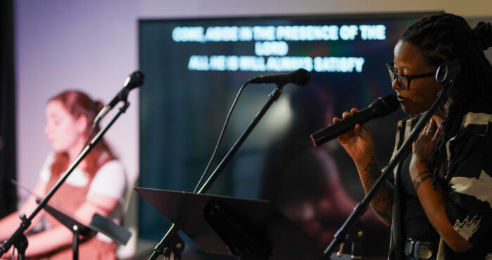
Why Worship Auditions Fail (And How To Fix Them)
Worship Auditions. Just the mention of this topic causes me to flinch a bit. Most leaders I know need a deeper worship team bench, but dread the “live tryout” vibe that feels like a bad episode of American Idol. You block off a Sunday afternoon, sit through hours of back-to-back auditions, and by the end, maybe […]
One of the great advantages of living in the 21st century is how accessible learning has become. We can pick up new skills almost instantly—watch a YouTube video, scroll through an online tutorial, download a lecture, or even access music education around the clock. In so many ways, it’s never been easier to grow. But […]

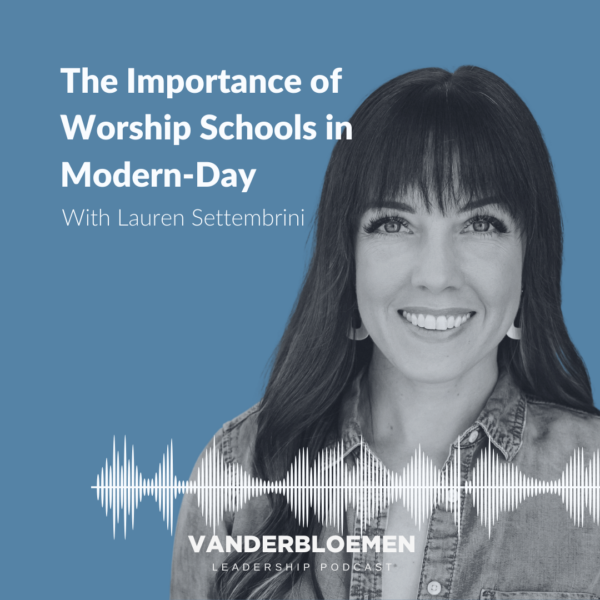
The Worship Leader the Church Actually Needs
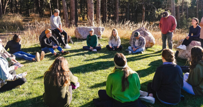
Each intensive, they trickle in one by one—guitar cases in hand, eyes bright with expectation, ready for hours of jam sessions and song-sharing. But within the first hour or two, they realize this is a different kind of worship school. One that cares less about how well they can play like a rockstar, and more […]
Why ‘Worship Leader’ Isn’t in Ephesians 4 (And Why That Matters)
Several years ago, during a moment of sudden insight, a college friend of mine argued that “worship leader” wasn’t a legitimate role in the church since it doesn’t appear in Ephesians 4. Normally, these kinds of ministry debates don’t catch my attention, but this time I was intrigued. Was it possible that the Apostle Paul […]

Holy Week has begun. It may not “feel” different from any other week – aside from the frenetic work to prepare for Easter Sunday – but it is indeed Holy because it was Jesus who lived through these events. Most of us will know that Holy Week begins on Palm Sunday and culminates with Easter […]

My first encounter with Ash Wednesday came my freshman year of college. I vividly remember the moment when our NT professor came to class late from a noon service with a smeared black cross on his forehead. I had zero context for his appearance, but as he gave a brief explanation my first thought was: […]
2 Manual Video Posts / Horizontal
Ninja Forms
Display a stylized Quote block